In email marketing, one of the best ways to determine the efficiency of your effort is to collect and analyze important metrics such as click-through rates (CTR). Understanding this and other key metrics allows marketers to assess the performance of campaigns, make data-driven decisions, and swiftly optimize strategy.
In this article, we’ll look into the impactful factors and the most effective ways how to improve click-through rate in email with examples.
What is an Email Click-Through Rate?
Email marketing click-through rate is one of the main metrics to measure efficiency. When evaluating how well an email campaign is engaging recipients, email marketers use this measurement as one of the criteria for successful performance. The total number of emails sent determines the proportion of recipients that clicked on at least one link or call-to-action button in the email. A greater click-through rate suggests that the calls to action and content in your emails are effectively engaging your audience and encouraging them to act. Find a more comprehensive answer to the question “What is email CTR?” and the discussion about ways to grow this rate in our podcast on the topic.
In short, an email click-through rate is the percentage of people who open your email and click on your call-to-action or anywhere in the email.
How to Calculate Click-Through Rate for Your Email Campaign?
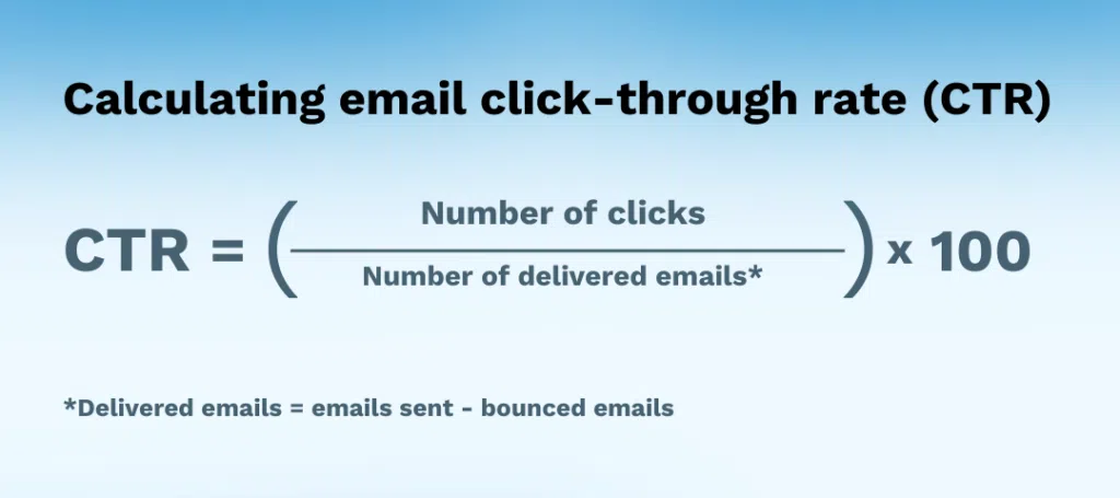
When you have all the data and analytics from your campaign, it’s easy to calculate the email click-through rate using the formula. You simply need to divide the number of link clicks by the number of emails delivered and then multiply the result by 100.
What is a Good Click-Through Rate for Email?
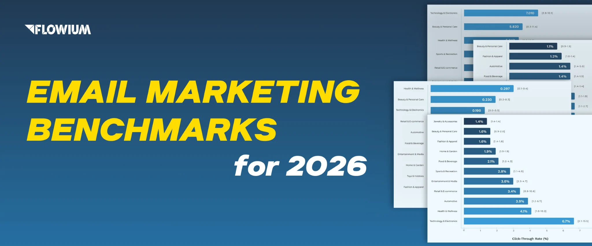
A good click-through rate in email marketing varies significantly across different industries, audience demographics, the type of content, and the specific objectives of each campaign. However, we can establish some general benchmarks for what constitutes a good CTR for email campaigns.
In 2025, email marketing should aim for a click-through rate of between 2% and 5%, though this can vary depending on the target and sector. Measured results exceeding 5% are regarded as above average. Rates below 2% may point to areas where targeting or content strategy needs to be strengthened. This is the average range for this metric but when it comes to establishing a clear benchmark, research from different email services shows different results.
- According to Moosend, the average click-through rate for emails across all industries is 4.01%.
- Mailchimp’s statistics show the average CTR is 2.62% across industries.
- CampaignMonitor reports an average CTR of around 2.3%.
Continuous improvement and campaign optimization require regular email performance analysis and monitoring.
How to Increase Email Click-Through Rate
CTR allows you to define what calls to action (CTA) work to reach your audience, and what designs or pieces of content need to be changed immediately. Naturally, after collecting all the data and seeing the performance analytics, whether it’s good or not, you’d strive to find ways for improvement. Flowium’s team presents you with the most effective methods how to increase email click-through rates that are relevant with all the 2025 updates. Here they are along with the tips from our professionals.
Strategic CTA to Boost Email CTR
Since CTR is a specific measurement to determine the efficiency of call-to-action elements, let’s start by highlighting the best practices for their improvement. Here are the proven strategies that ensure proper CTA optimization.
Use One CTA per Email
Start optimizing your design for improved CTR by using a single call to action to create a focal point. This makes it more likely that your recipients will understand your email’s objective and follow through. Keep your emails free of website-style menus, which can divert attention and lessen the impact of your call to action. Focus on one topic (product, service, etc.) in your message, and use one distinctive CTA to direct attention and urge people to click your link without confusing them.
Remember that too many clickable options might result in no clicks at all.
Consider Strategic Placement of CTAs
Of course, not all businesses can apply the recommendation above. Depending on the line of work and marketing strategy, some of them need to use several calls to action per email to effectively convey the message or present the offer. Especially for long emails, you’ll need to include CTAs in multiple locations to increase visibility and clicks.
How do I increase CTR in this case?
The solution is in the smart positioning of your CTAs. It’s important not to hide it at the bottom where readers could overlook it. Instead, think about distributing it thoughtfully throughout the email in a few different places. This can entail emphasizing it at the top where it is easily seen, repeating it in the center for emphasis, and adding it at the bottom of lengthy emails so that recipients can scroll through them.
Pro Tip: Don’t hide your CTA at the bottom of the email. Place it strategically at the top, middle, and bottom, especially in longer emails.
Keep a Clear CTA Hierarchy
If you use a few calls to action and want to grow your click-through rate email metrics, use the power of visual and informational hierarchy. You can also use the reversed pyramid principle which means placing the main call to action at the top and a few secondary links at the bottom of your email hidden inside text or among pictures.
You can see in the Jones Road email example that the primary CTA “Shop nourishing skincare”, which represents the goal of this email, is a button located close to a focal point. There’s also a secondary CTA, a hyperlink placed in the text, which is less distinctive and located lower according to the rule of hierarchy. Such a combination allows marketers to provide helpful information without distracting clients from the main point. This example also shows the utilization of different call-to-action formats which is also one of the best practices for rate improvement.

Make Creative Calls to Action
Let’s be honest, generic calls to action like “Shop now” / “Buy now” cannot spark interest. Yes, they definitely serve their purpose by providing clear instructions but that’s pretty much it. If you want to provide clients with a more distinctive experience and ignite interest in exploring your offers, be more creative about your CTAs. Instead of typical wording, use popular catchphrases, short but striking slogans, and even wordplay or memes relevant to your brand. This creativity and optimization in line with your case will help you to adhere to another principle of how to improve CTR.
Email Personalization
Personalizing your emails based on the traits of your recipients is another effective strategy businesses can use if they aim for an increasing click-through rate. This entails using the collected data from your previous campaigns to modify the email content accordingly.
Use Personalized CTA
The first thing you can do is, once again, work on your calls to action. For example, you can show more care and a personalized approach through your CTA for your current or regular clients to inspire them to make another purchase. At the same time, a clear “Buy now” call to action may work better for non-customers since it’s neutral and can appeal to anyone. If you contact a regular client or plan to re-engage someone with a winback flow, then it makes more sense to change buttons accordingly. You can see this method used in the example below, where marketers optimized it according to the purchase history.
Pro Tip: Send different emails to buyers versus non-buyers with tailored CTAs. A buyer might receive “Buy Again,” while a non-buyer might see “Buy Now.”
The statistics also prove this practice. HubSpot reported their analysis that shows a 14% increase in click-through rates with personalized CTAs. Top email marketing platforms such as Klaviyo enable this type of customization by allowing you to include numerous calls to action and display the most appropriate one based on the recipient’s profile.
Create Personalized Content
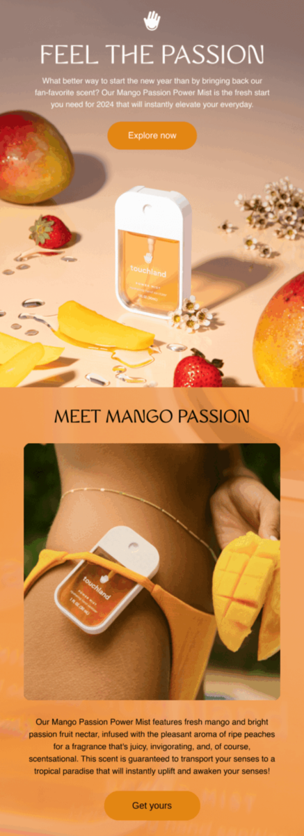
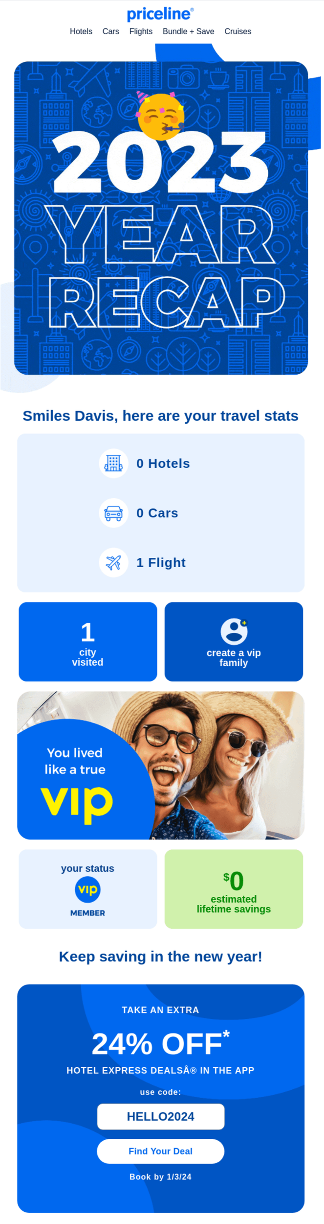
Aside from calls to action, you can attune the content of your message. To do that properly and create individualized emails, make full use of the collected information about your clients e.g. name, age, gender, products they showed interest in, history of purchases, etc. Start by addressing your recipients by their names and add more context based on what you know about them. A perfect example of personalization is a Year-in-Review email that brands usually send during New Year’s promotions. Every year the rates of this email skyrocket simply because people are curious about the type of content that regards them personally.
Opt for Advanced Segmentation
None of the previous practices will work if you don’t segment your contact list properly. Without strategic email segmentation, all those customized emails won’t find their target audience which can result in low CTR and overall campaign deficiency. The reason for such results is simple – people aren’t interested in your offer so they don’t click. For example, you sell street-style clothing for teenagers and young adults but send emails to everyone in your unsegmented list including the 40-50+ age segment. As you can guess, in this situation practically all rates will be decreased. Moreover, messages that are sent without the target audience in mind can often be flagged as spam.
Starting from February 1, 2024, Google and Yahoo put in action updated requirements for email senders including a new spam complaint rate of 0,3%. If you exceed this rate, more of your emails will go in a spam box. Read more about new regulations in our article here.
Create Automated Email Flows
Another way to achieve personalization and one of the best ways how to improve click-through rates is the use of flows. It’s a sequence of automated emails that are sent according to a subscriber’s contact details, activity, or preferences. One of the popular examples of personalization with flows is a birthday email sent to your subscribers based on the info from their profiles. Use this and other types of automation to establish a deeper connection with clients and encourage them to take action. You can set up these automations in Klaviyo and other platforms or turn to Flowium for assistance.
Mobile-Responsive Design and CTA
Making your email layout and call to action mobile-responsive is the next vital strategy to improve email click-through rate. Your email design and CTAs might look great when viewed on a desktop. However, without optimization, they become unreadable and extremely small when viewed on a mobile device. Naturally, your mobile CTR will drop, as well as a bunch of other important metrics.
Here are my recommendations on how to deal with this task:
- Ensure your CTA is easily clickable on mobile devices.
- Design your emails so they lead the reader naturally to the CTA.
- For the correct placement, imagine your email as a triangle pointing down, requiring the recipient to scroll down to reach the call to action.
- In the case of several calls to action, avoid using an excessive number of them in email headers or concentrating in one place.
- Avoid using images that don’t scale well.
- Make sure the layout of your emails is correct to be fully displayed on mobile.
- The best practice on mobile is to use one call to action per screen.

Call-to-Action with GIFs and Video
Using GIFs and video for your messages not only helps make designs more distinctive and engaging but it’s also a proven method to achieve high click-throughs. According to the results of split testing, animated CTAs win over static ones. They can help you increase click-through rate email results by 0,3%. Although it doesn’t seem much, for large enterprises with tens of thousands and more subscribers 0,3% is actually a lot of clicks. Even if you’re a small business, take this opportunity to increase CTR by utilizing animations and videos to create more interesting and engaging content formats.
For more information, listen to our podcast about personalized animations for CTR growth.

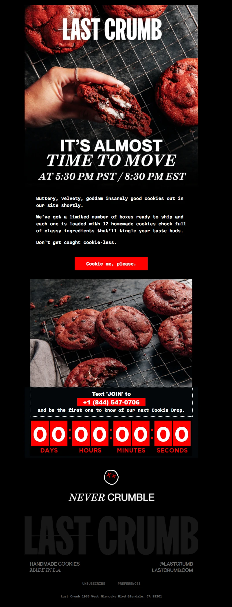
Time-Sensitive Emails
Creating urgency in your emails might prompt clients to click on your buttons and links. It’s a little psychological trick that marketers and designers often use to encourage engagement. After all, people tend to be more interested in all kinds of limited offers that promise uniqueness. Making your messages time-sensitive is a great way to reach the desired KPIs in email marketing. Here are a few tips and ideas to implement this practice.
- Set up a countdown (sale period, special discounts, upcoming events, etc.).
- Use expressive words in call-to-action elements and throughout the text (available now, buy today, starts tomorrow, don’t miss, last chance, etc.).
- Use holidays as a special occasion (prepare themed emails like congratulations on Valentine’s Day or any other festivity while also offering your products).
- Don’t fake urgency (your special offers must expire on the designated date if you don’t want to make your customers feel tricked).
Gamification
One of the techniques to increase click-through rates is gamification. It boosts engagement by incorporating game mechanics into non-gaming circumstances, such as emails. Email marketers use game elements like spin-the-wheel, quizzes, riddles, interesting surveys, and whatnot to get users to interact with emails and earn prizes. This method produces an engaging experience that appeals to feelings and leads individuals toward common goals. Subscribers get immediate feedback on their choices and actions, which helps them take the next steps to achieve more.

Text-Based Emails
With the plethora of tools and services from design agencies enabling businesses to create eye-catching emails, many people make the mistake of fully dismissing text-based messages. Even without distinctive design and graphics, this type of email can fully convey the message and serve its purpose as a part of bigger email campaigns. I advise sending 2 or 3 text-based emails per campaign in between image-based messages. This strategy works because it attracts attention by breaking the usual pattern. Moreover, some people comprehend text-based messages better than vivid designs with various visuals so you can make information more comprehensible for them and receive better results in general.

Keep It Simple
Don’t overload your emails with too many products or CTAs. Simplicity leads to clarity, which increases engagement. Readers are more likely to notice and interact with the call to action when the email is easy to skim through and has a clear, uncluttered design. Additionally, simplicity guarantees quicker email loading times, which enhances user experience, particularly on mobile devices.
Tracking Click Behavior
Use heatmaps to understand where recipients are clicking in your email. This insight helps you focus your efforts where they matter most. For example, if 80% of clicks happen in the first part of the email, you may not need to invest in creating long emails.
Test and Optimize
Always split-test different elements of your email campaigns, such as CTA language, design, and placement, to see what resonates best with your audience. By analyzing the results, you can refine future campaigns to not only improve click-through rates, but also maximize conversions, and better cater to your audience’s preferences.
Split-Test Ideas to Improve Email Click-Through Rate
We already established that split testing is key to the correct optimization of your campaigns for increased CTR. To give you clearer directions, here are some ideas on what you should split-test in your emails or automation.
- Use Countdown Timers
For exclusive offers or time-limited promotions, use real-time countdown timers to generate a sense of urgency. This promotes prompt action and boosts click-throughs to benefit from the deal.
- Visual Directions for the Reader
Use design elements like arrows or numbered steps to guide readers through your email.
- Experiment with Text Colors
Test different hyperlink colors to match your brand and grab attention.
- Integration of User-Generated Content
Display authentic customer testimonials or stories with a call to action that leads to more such articles on your website. When people witness others enjoying a piece of information, they are more likely to interact with it themselves.
Remember, there are no set rules for achieving a high click-through rate. Factors like your brand, audience, industry, and timing all play a role. Always split-test, collect data, and refine your approach based on results.
Conclusion
I hope this article gave you a complete understanding of the best ways how to improve email click-through rates. To maximize the effectiveness of your email and boost CTRs, embed each of these crucial strategies within your marketing campaigns. If you need a professional team to take over this important task, our specialists are happy to assist your company.
Contact us now to start working on maximizing your click-through rate for email campaigns.
Frequently Asked Questions
What is a UCTR?
The quantity of distinct clicks on an email’s links is known as the unique click-through rate. Even if someone visits the same link five times, this measure only records one click. Therefore, UCTR might be more helpful if you want to determine how well your campaigns convert your target demographic.
What is the difference between click rate and click-through rate?
Click-through rate calculates the proportion of recipients who clicked a link out of all those who opened the email, whereas click rate measures the percentage of all recipients who visited a link. You can read our article about the differences to find more information.
How to fix low email CTR?
To fix low metrics for your emails, use all the mentioned strategies and tactics diligently. They have proven their efficiency and shown considerable results targeting not only the increase of this specific KPI but other important metrics as well. Summing it up in a short answer, you need to concentrate on developing visually striking, action-oriented CTAs that are captivating and easy to understand. Make sure your email design is simple, mobile-friendly, and free of any distractions that could draw attention away from the call to action. Use attention-grabbing subject lines, tailor your emails with pertinent content, and try A/B testing to see what works best for your audience.