I’m going to walk through the basics of email benchmarks in Klaviyo.
Benchmarks are a key metric for measuring your success with email campaigns, and they can be really useful when you want to compare how different campaigns stack up against each other, or even compare yourself against competitors!

So how do you know if your emails perform good or bad? You can Google it, find some stats like, oh, 25% open rate, 30% this, 2.5% click rate and so forth. However, those are generic numbers. Maybe you’re in some kind of weird industry that the same rules it’s not applied to you. And maybe your open rates is 50% bad.
That open rate for your industry is very low. So how do you know? So that’s why Klaviyo benchmark is so powerful.
If you go to Klaviyo.com, if you go to analytics and when you click on Benchmarks, this information is priceless.
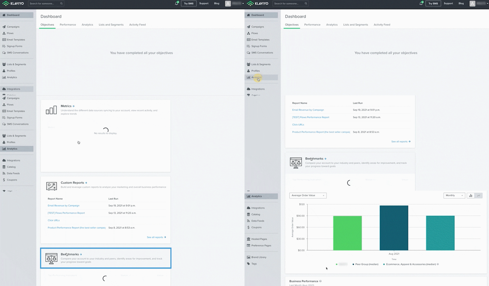
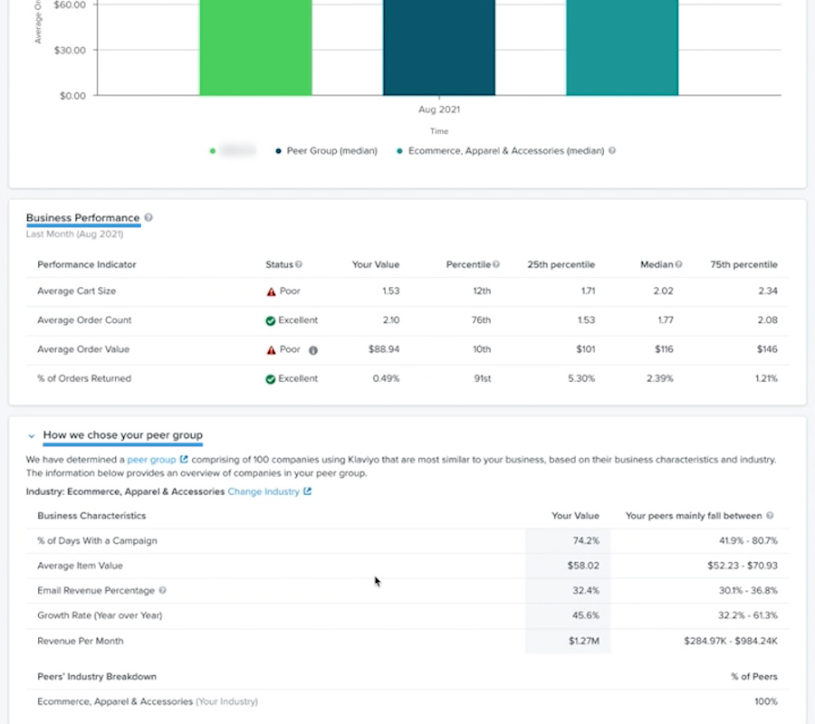
So they’re comparing you to two things. First, they are comparing you to same brands in your same industry and second to peer group. And how do they define peer group? As you can see, here is how we choose your peer group and you can read more and see what value they use. So you are able once a month change your industry.
I don’t think you will change it a lot, but maybe Klaviyo automatically picked the wrong industry. Maybe you are in food and beverage and they’ve picked wine and spirits or something like that. So you are able to change that group once a month, and it will show you the exact stats for that specific group.
So what we are able to see here, actually, let’s go through email campaigns. So why it’s important and why it’s a great example. So as you can see here, their statuses are a little bit off and the words they use sometimes is very aggressive. Something like fair or poor, excellent. What they just mean is this is your value. This is your value. So in this case, open rate is 32%.
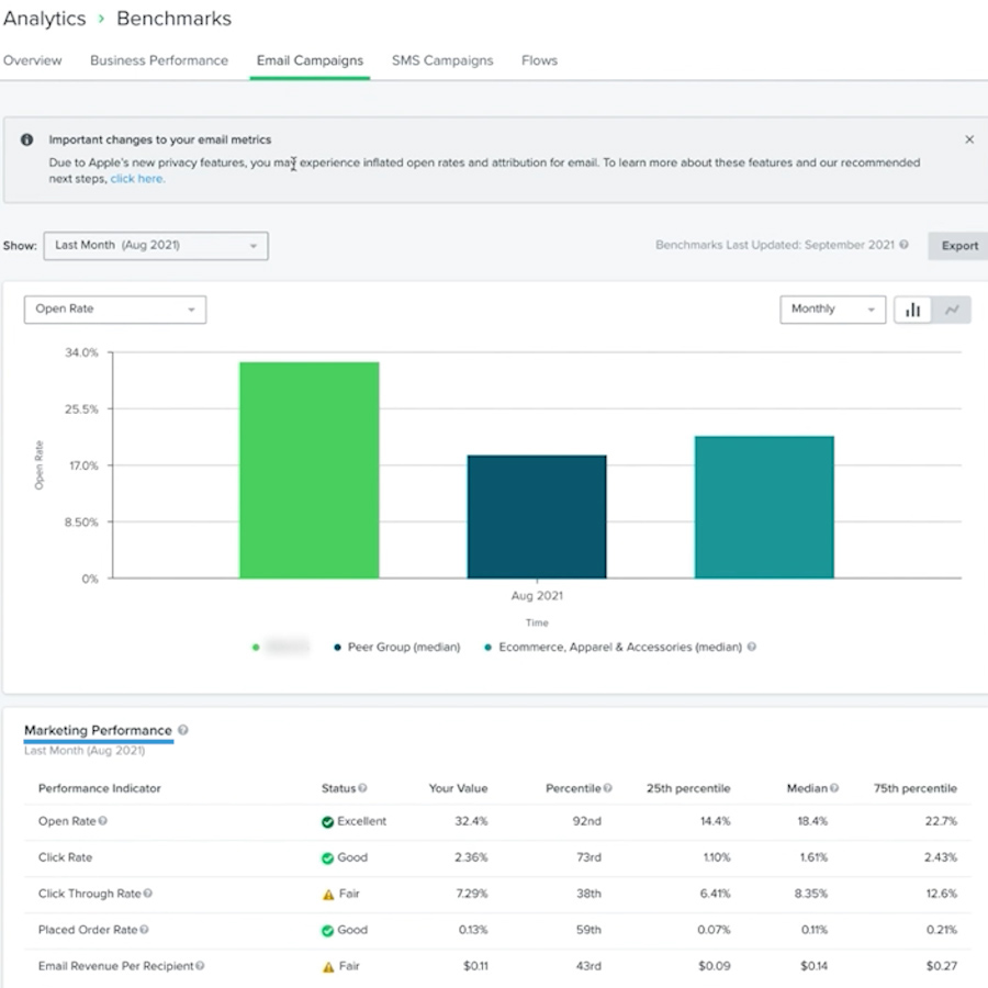
This is… What does it mean? It means that of the entire group, only 25% of the entire group has an open rate 14.4%. The median, like 50% of the group is approximately 18 and 75% of the entire group is having this 22.7. So in this case, this brand performs better than 75 percentile. So if we do, let’s say 13%, it will set poor rate mark and say like, “Hey, you’re doing a bad job.” But basically those statuses is only giving you idea what’s going on here by numbers.
So what is our internal goal and what I would recommend to you? We all want to strive here to 25% percentile. However, if you, for example, lower than 25 percentile or you’re in the poor zone, first goal should be to get to here. And the second goal would be to get there. When you are done with this, median is good enough and you can move on down to the list.
By the way, don’t try to improve all of them at the same time, try do one by one because if you improve the open rate, everything else likely will improve and so forth.
So this is benchmarks explained in short. I hope it helps. If you have any additional questions, please let me know.
And also we had a guest on our podcast, I believe last year and the guest was Jon Palmer and he’s one of the people who helped to create those benchmarks, so I highly recommend to listen to that episode. And also, if you have any additional questions, feel free to ask me under this video and I will respond in a day or two. Thank you.
If you want quantifyable results when measuring your customer loyalty, NPS is the way to go. We have a NPS calculator to make it easy for you to understand how likely your customers are to stay.



![How to Do a Klaviyo Audit? [Expert Guide]](https://flowium.com/wp-content/uploads/2023/02/klaviyo-audit.png)
