
Ensuring the efficiency of email campaigns is a principal goal for every business that invests in promotions through this channel. However, it’s not a simple thing to do if you don’t know how to properly analyze campaign performance and outcomes. To not let your investments go in vain, you must constantly optimize your strategy and apply the best practices for improving such important KPIs as open rates, CTR, conversions, and others. One practice that we advise to adopt is using email heatmaps. It’s a go-to tool for professional marketers that helps increase click-through rates, conversions, and the overall quality of your campaigns.
How?
In this article, we’ll present this tool and show you how to use heatmaps to help you optimize your emails rather than relying solely on guesswork.

What is an Email Heatmap?
Heat maps are mostly used to optimize website performance. However, few people know they can also improve click-through rates and your email designs in general. Your emails can’t be 100% effective if you don’t know where people click on them or which sections they interact with the most.
An email heatmap is a feature that provides a visual representation of the most popular links, the percentage of recipients who clicked on each link, and how recipients interacted with the email.
Analyzing the email heatmap provides comprehensive information on how well your email marketing campaign is performing. From this analysis, you can receive such important optimization data as:
- The links that are most frequently clicked;
- Links with the fewest clicks;
- The most clicked CTAs;
- How many email subscribers clicked on each link, expressed as a percentage;
- Info on additional email components with which subscribers engaged the most.
Types of Email Heatmaps
Before starting to use this feature for your email marketing improvement, you should be aware that there are a few email heatmap types. Their accuracy, usability, representation, aesthetic appeal, and use cases vary greatly. We can divide them into two groups—by data display (colored, colorless) and by data type (click, scroll, mouse movement). Here is more information on their advantages and differences to help you understand what type is better for your case.
Colored Email Heatmaps
In this type, the data on client behavior in your email is displayed using different color density gradients. Because of this presentation, colored heatmaps display data about clicks, scrolling, and mouse tracking in a more user-friendly and intuitive way. However, you should remember that colored email heatmaps are less accurate than their colorless counterparts, which are more precise. In terms of use cases, colored heatmaps work better with simpler datasets when emphasis is placed on data visualization.

There are also several types of colored email heatmaps that display different data types using the same gradient technology. Colored heatmaps can be the following.
- Click Maps
Click maps allow you to see where users are clicking on your emails. Seeing this information can help you with strategic CTA and link placements, and identifying pain points. Optimizing the locations that receive the most clicks can increase conversions.
- Mouse Tracking
The mouse tracking heatmap displays the user’s mouse movement on your emails. Despite its potential effectiveness, it is not always accurate because the mouse’s direction does not indicate that the user’s eyes are in contact with that specific area of the page.
- Scroll Maps
Depending on how far a person scrolls down, this kind of colored heatmap displays how often they interact with your emails. The areas with the brightest colors usually indicate the email’s most seen sections, while areas with cooler colors indicate the least viewed sections. Knowing what part of the email has the most of the user’s attention and actions, you can enhance your campaign design and message. For example, if the header of your message is the most seen, you can try including links in the email’s upper body to increase click-through rates.
- Attention Heatmaps
Similarly to the previous type, you can see how much attention certain parts of your emails get by using attention heatmaps. This operates by monitoring the users’ eye movements. With the development of AI features by some of the ESPs and the active use of predictive analytics, you can optimize your campaigns to direct readers’ attention.
Colorless Heatmaps
Colorless heatmaps use forms, sizes, icons, numerical data, or grayscale to depict data, so they may be harder to understand. This kind of heatmap avoids the possible distractions or emotional reactions that come with color-coded graphics in favor of delivering insights simply and precisely. When it comes to use cases, colorless email heatmaps are perfect for examining more intricate datasets that call for greater accuracy and precision.
Why Use Email Heatmaps
Unfortunately, many business owners waste their money on email campaigns that don’t yield very good results in terms of clicks and conversions. Knowing where the clicks are coming from is a crucial solution for fixing such issues.
- Easier Optimization Process
Do more subscribers, for instance, click on the call to action or the image? Do I need to change my style or template? In this case, email heatmaps can assist you make sense of the click data. Knowing what draws clients to action can help you incorporate it into upcoming campaigns.
- Better KPIs
Use heatmaps to optimize your emails for higher conversion rates by identifying the most and least popular areas in your email campaigns.
- Improved User Experience
It can be difficult to determine how effective email marketing is, especially when there is a lot of content and connections. To improve the user experience and increase email performance, you must understand which sections or links capture your readers and motivate them to take action.
- Understanding Subscriber Preferences
Real-time journey email insights now provide a comprehensive picture of your audience’s preferences by showing how they interact with your emails. This instant visual feedback highlights the information that most appeals to people, allowing you to modify your messaging for increased impact and higher conversion rates.
How to Use Email Heatmaps to Improve CTR
Seeing the heatmap of your email isn’t enough—you must know the ways and effective strategies on how to use the received data. Enhancing your campaign performance will be easier with the best practices shared by our experts. Here’s how you can use data from your email heatmap.
Determine Email Hotspots and Optimize Layout
You can enhance your marketing by using email heatmap research to identify the areas of your emails that receive the most clicks. Your email CTAs should be placed near the top of your emails if you find that buttons or links there receive more hits. This will increase your email engagement rates.
According to industry standards, for instance, if the primary banner is performing effectively, between 30 and 40% of visitors should click on it. The banner’s design or copy may need to be improved if it fails to accomplish this. Ideally, 70–80% of clicks should go to a single ad in a brief email, such as a sale notification.
Usually, 40–50% of clicks are made on the email body, which displays the goods or categories. Typically, the footer receives 10–20% of clicks. Depending on the type of email—sales, new arrivals, or other marketing, for example—these ranges might change.
Fix Issues and Broken Links
Finding repeated clicks on a particular email location within a brief period in your heatmap data is a simple method to determine whether your email has broken links or bothersome issues. Users’ frustration is what leads to the anger click appearing on your email heatmap. This might be the result of visitors trying to click on these areas frequently and finding that the links are broken or unlickable. To maximize conversion rates, it is essential to identify these areas. If left unchecked, this results in fewer purchases or users closing your email, which raises the bounce rate.
Simplify the Checkout Process
Optimizing the checkout process can increase the conversion rate. Your checkout procedure can be overly drawn out or complicated. Other components of your email, including menu symbols, display information, ads, or email discount codes, can also divert their attention. Use email heatmaps that display scroll or click types to see when clients start to lose interest in or abandon your checkout process.
By looking at your heatmap data’s clicks and scrolling, you’ll be able to determine what stops users from completing or even starting the checkout process.
Test your Email Components
The main objective of email marketing is to increase sales. By using user data from heatmaps, you can determine which parts of your emails, such as product photos or calls to action, receive the most and least clicks.
You can even determine whether your clients continue to look at your product photos or call to action.
Utilize A/B testing to establish which placement generates the most click-throughs based on user behavior. Then, use that information to optimize subsequent emails.
Optimize Message
People typically skim through emails; heatmaps provide more evidence of this. Therefore, it’s best to place the most crucial information in your message where it will be seen the most. We recommend optimizing your email text by incorporating high-quality visuals, writing succinctly, and properly dividing your sections.
Combine With Proper Segmentation
You can determine how various audience segments interact with your emails by combining segmentation and email heatmaps. This knowledge enhances relevance and improves campaign performance by tailoring content and design to each group.
How to Fix Email Heatmap Feature in Marketing Software
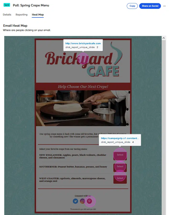
Most, if not all, email service providers can track where people click. However, not many of them provide the email heatmap feature to track the activity of each distinct link and email component. It means that if you have the same link in multiple locations within an email, the platform records all clicks on that link as a single click, regardless of its location. In this case, you can’t determine whether someone clicked on the top link, the bottom link, an image, or a button.
Let’s look at our example to see more clearly how this works in your typical ESP. We use ActiveCampaign internally for our agency and Klaviyo for our customers. In the example, we have 39 people who clicked on a link at the top of an email and another 39 who clicked on the same link at the bottom. While 78 clicks were made, the platform only shows that 39 people clicked in total. So we can’t distinguish which link location was more effective.

This issue is common across all email marketing platforms, including HubSpot, Klaviyo, ActiveCampaign, and others. While third-party tools like Email on Acid offer advanced solutions for this, they can be costly—up to $100 a month for that feature.
This lack of detailed tracking can be a problem because it makes measuring your emails’ effectiveness difficult. Fortunately, there’s a trick to fix this, and we’re going to share it with you. There are even two possible solutions that anyone has at least basic knowledge of HTML email creation. Here they are.
Solution 1
Here’s a simple and free solution: use a query parameter. You can add identifying URL parameters to your email links to help you determine where users are clicking. For instance, you could have the following in place of a button and an image that both point to www.example.com:
www.example.com/?link=button
and
www.example.com/?link=image
Both of the links would still go to the same place, but they will be tracked separately in the Link Activity report.
Solution 2
As an alternative, you can make use of the UTM option utm_content, which is useful for this.
Example:
www.example.com/?utm_content=button
and
www.exmaple.com/?utm_content=image
In addition to being able to identify clicks in analytics, this method also gives you the advantage that most analytics programs, such as Google Analytics, can assist you in drilling, filtering, or grouping by that parameter. For instance, now you’ll be able to examine how the performance of images versus links compares across various campaigns or emails (assuming you use consistent values).
Top Email Heatmap Tools
If you don’t have the required skills to implement previously mentioned solutions, or simply don’t have time to do it manually, you can use special email heatmap tools. There are plenty of services that provide this functionality but we advise using those that focus on email specifically. Here’s what we have on our recommendation list.
Email Heatmaps

Starter – $11.95;
Professional – $28.95;
Unlimited – $56.95;
Email Heatmap is one of the top tools that makes it simple to determine which links have done the best by providing a visual depiction of the “click” outcomes from email marketing campaigns. It generates a temperature gauge that goes from cold blue (no clicks) to red hot (the most clicks).
Email Heatmaps offers a wide range of available integrations, including popular email marketing platforms like Klaviyo, Active Campaign, GetResponse, Mailchimp, Constant Contact, Campaign Monitor, and others.
Email on Acid

The Basics – $99 (billed monthly);
Premium – $179;
Enterprise – custom;
Email on Acid is a cloud-based email tracking tool that enables users to test email content. It can be used by freelancers, small enterprises, and large agencies. Campaign pre-checking, email testing, an email editor, email statistics, spam testing, and email templates are some of the main features of Email on Acid. Users can identify formatting errors, broken links, and code issues with its mail testing feature. Additionally, users can preview emails on tablets, smartphones, and PCs.
Emma, Salesforce, Mailchimp, CampaignMonitor, iContact, and SendGrid are among the available integrations for Email on Acid.
Final Thoughts
Understanding how your customers respond to your emails is the only way to enhance your email marketing strategy. A quick and easy approach to see where your subscribers click in your emails is by using data from an email heatmap. Based on the received information, you can apply the practices we shared and improve the quality of your campaigns. If you need any assistance with the optimization process, you can rely on the expertise of Flowium’s team. Contact us now!
Frequently Asked Questions
☑️ How often should I do email heatmap analysis?
It’s usually enough to perform heatmap analysis once a month or whenever template or layout modifications are made. You can determine the top-performing layouts by examining heatmaps for different email types.
☑️ What’s the difference between total clicks and unique clicks?
The term “total clicks” refers to the total number of times a link has been clicked, including repeated clicks by the same individual. On the other hand, unique clicks only count one click per person, no matter the number of times they click the link.
☑️ How to pick an email heatmap software?
Although there are several heatmap tools available, not all of them are suitable for your company’s needs. When deciding on your options and requirements for the tool, consider the following criteria:
– Email heatmap type;
– Feature set and limitations;
– Usability;
– Compatibility with your services and available integrations;
– Pricing.