In this video, we are going to be sharing what is dark mode and how to optimize dark mode for your email marketing campaigns. Sometimes, people can find it very hard to read normal black on white text at night time, especially on a phone.
Sometimes, the photos and logos included in your emails can disappear but when in dark mode, they appear and stand out very clearly. It is important that emails are optimized correctly, so the potential client is getting all the necessary information.
I will be explaining the best colors for your text and background, so they stand out and pop. Also, the text and image sizes to use, to make sure everything fits and is easy to read.
By the way, don’t forget to watch the video where we cover the 5 mistakes in email design we’ve seen over the years and explain how to fix them.
It is important to test how your emails will look on a variety of email service providers, Google, Outlook, Yahoo and more, not only the email but also how it will look on a mobile, laptop and PC.

What is dark mode?
So first, what is dark mode? Dark mode is something that gives email designers lots of anxiety, and maybe you too. Maybe you are creating a beautiful campaign. You send yourself a test and you can’t read anything. We’ll talk about why that happens.
Benefits of dark mode
So firstly, what are the benefits of dark mode? Better for low-light environments. So at night, when you’re laying in bed and scrolling through your phone like I know we all do, it’s perfect for that. It’s easier on your eyes, saves your battery, reduces screen glare, and then it just, it looks cool overall. So some people use dark mode all the time during the day and at night.
So important stats. Did you know that between 80 and 95% of subscribers prefer using dark mode?
I was really surprised by this. It’s been coming up a lot lately that clients will send a test message. They can’t see their logo or some other issue comes up.
So we know now that it’s super important to really work on this in your email campaigns. It’s time to cater to the rising number of subscribers that are using dark mode. So this is something that you really want to take a look at every time you’re creating a campaign.
Examples of emails
Well, what happens in dark mode? So you can see here of an example of the same email we’re showing here as in light mode, and this is in dark mode. And you can see that this black text, it’s converted to white, and then your light background colors.
So the white here and then this blue, it’s converted to a dark background. So something here that’s really interesting and hard to manage is like you can see our logo, it’s almost gone, you can’t see it. So frustrating.
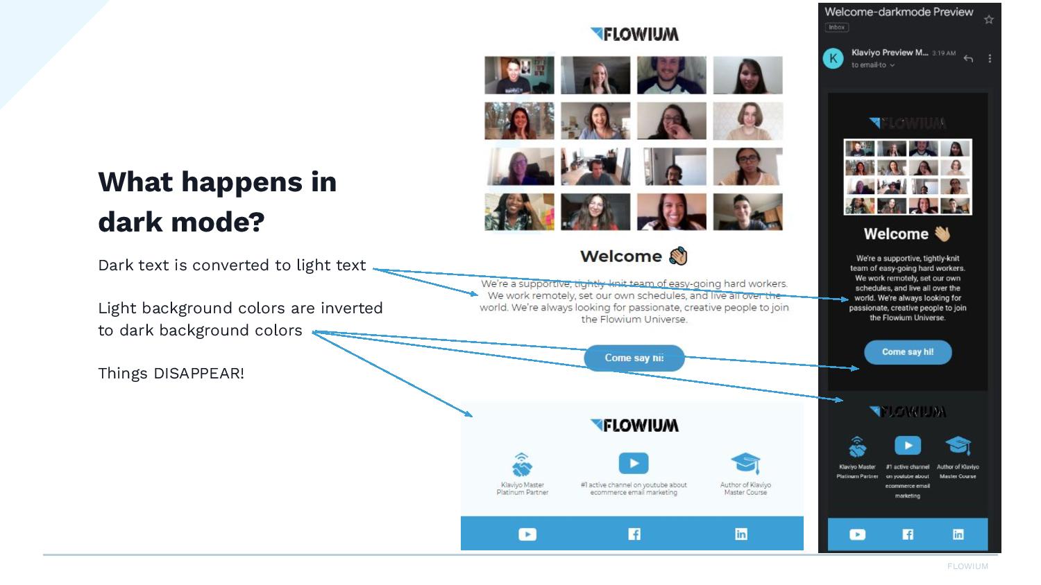
So our logo is black and it pretty much disappeared here. So what can we do to fix that? We’ll talk about it in a second.
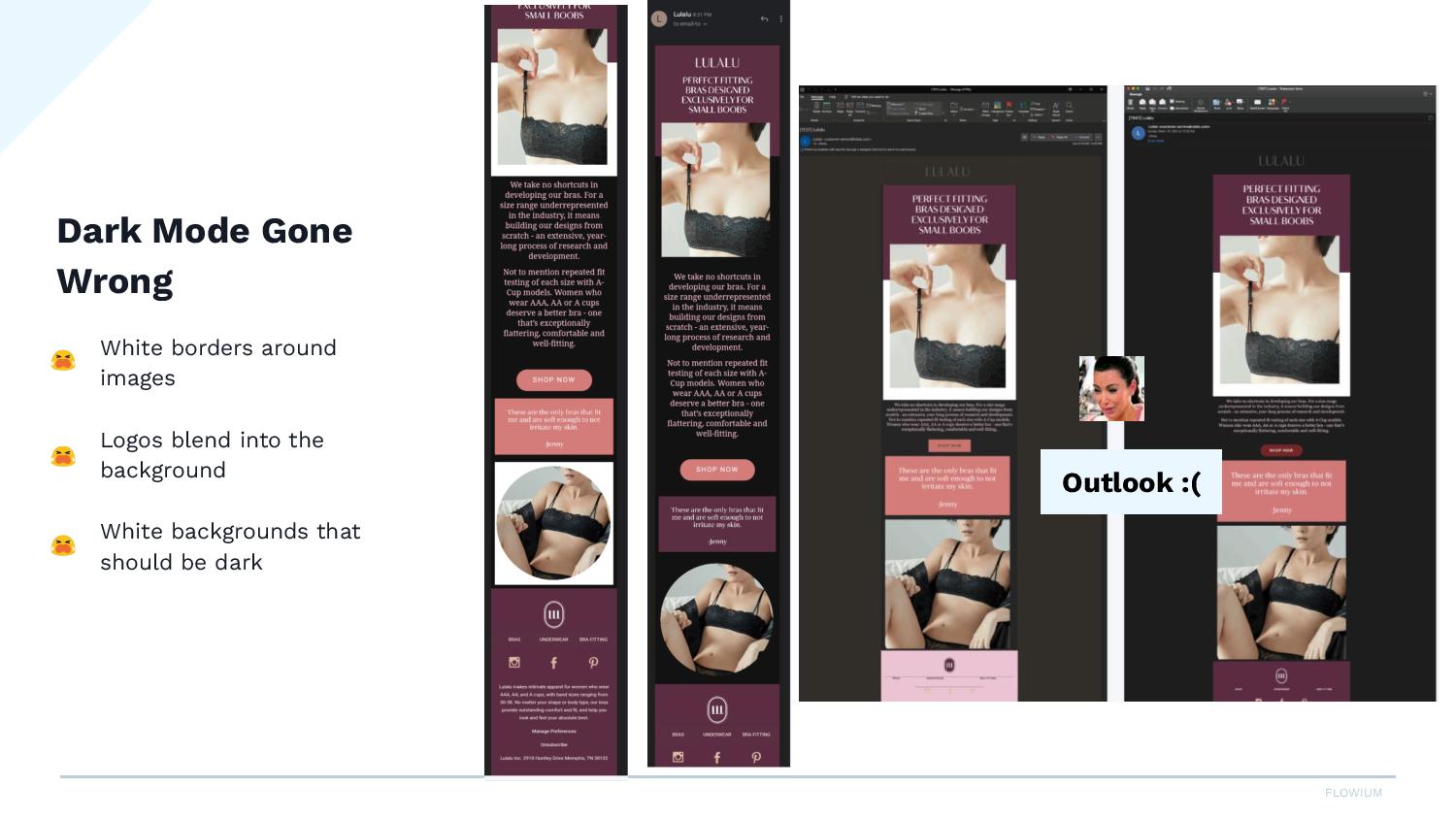
Here’s another example where we can see these white, I mean, these white backgrounds around our images. This is one of our clients, Lulalu. This is just a sample, but we worked pretty hard on getting their emails to display well in dark mode because so many of their users were viewing the emails in dark mode.
But you can see over here, their logo is black and you almost can’t see it. You can see here on this circular image, there’s this white border. So, I mean, it’s not horrible, but it does look a little disjointed. When you have this circle with the white box behind it, we don’t want that. We want it to look like this, where you can see the round edges of this image. And here, this is floating on the white background.
So a little bit of good news, for some reason, Apple has chosen to display HTML images in light mode by default, which is amazing. So many people use Apple. So that means that if you have what we were just talking about here, your email will always show up in light mode.
So you don’t even have to worry about this, but there’s plenty of other email clients that people are using and that will show the dark mode. So even though this is nice and thanks to Apple for making our lives easier, you still need to work on this for the other email clients.
Quick tips on how to fix dark mode problems
So how to fix some problems? Here’s just five quick tips.
#1 – Use transparent PNGs
Number one is to use transparent PNGs. So the transparent image has no background. You will see these, sometimes this checkerboard pattern. That’s how you know this is a PNG.
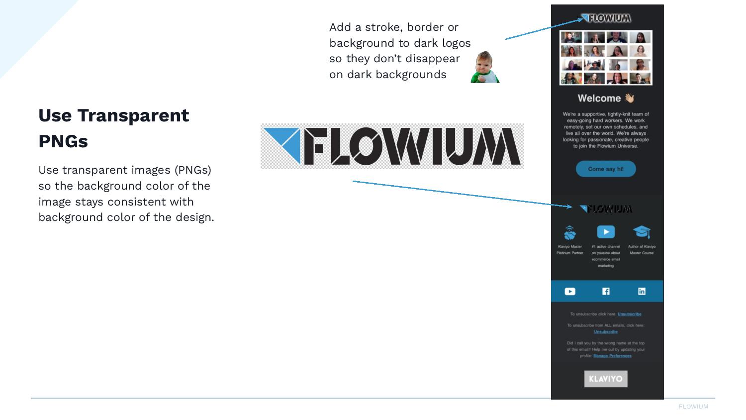
So wherever I placed this logo, the background will fill in. If I placed it on a pink box, the background would be pink. So you can see here how it disappeared on this black.
So something you can do with your logo, if the logo is black, you can add a stroke or an outline to the edges of your logo. You can put a border around the background.
Sometimes, we’ll see people putting a full-width colored background here, so the logo never disappears. So just something really to keep in mind if your logo is black.
One note on PNGs: so PNGs are really not meant for photos in email. We’re gonna use them sometimes to manage this dark mode issue, but PNGs will be really big if you don’t optimize them.
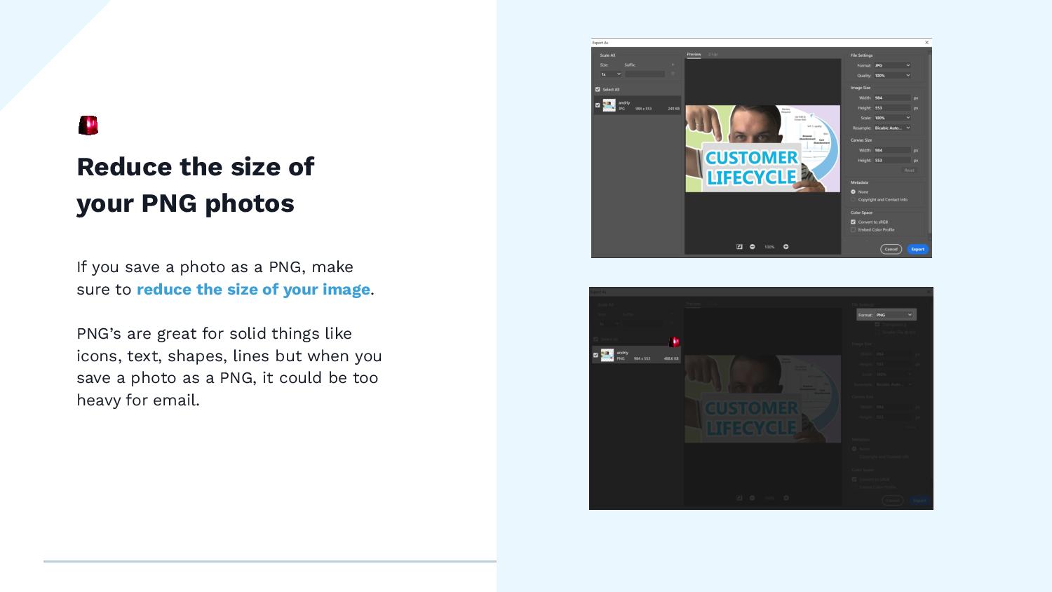
So here, I have an example. I have this photo here, it’s 984 pixels wide. When I save it as a JPEG at a hundred percent quality, it’s 249 KB. But when I save the same thing as a PNG, it doubles the size.
So you wanna make sure when you are exporting or saving your PNG images for email, make sure you’re reducing or optimizing the image. Otherwise, you’re gonna have all these huge PNGs. The email will take forever to load. And that’s just really not a good idea for deliverability.
PNGs really are meant for things like icons or lines, so anything solid. So using it for photos, it’s fine. Just make sure that you optimize.
#2 – Colors for email
And the next thing is for colors. Just make sure that you’re using poppy colors but that is not overly saturated.
So here’s an example. These are really saturated colors on a dark background. So they really do pop, but they are a little bit harsh on your eyes.
So if you’re looking for an accent color or maybe an icon color, choose something that’s a little less saturated, and it just reads better on the black background.
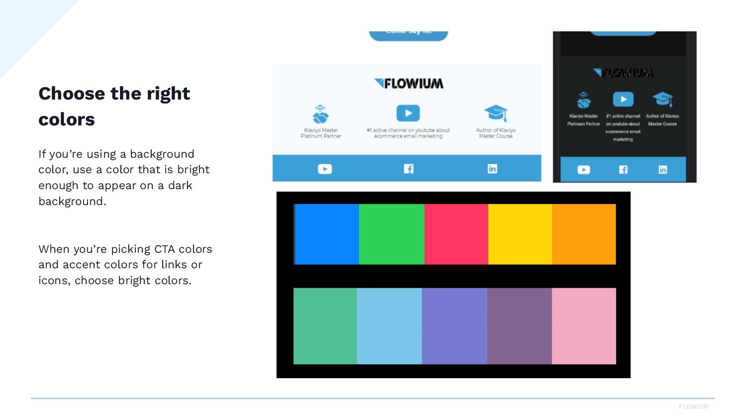
Like you can see here, we have this like blue color. It pops really well on black. And it’s a little easier on the eyes than if we had chosen something like this.
So this would apply for your CTAs, your icons, your logo, anywhere you’re using an accent color.
#3 – Double-check your icons
And then double-check your icons. So a lot of people will use these black social media icons, and you can see here, I have black on white and they completely disappear.
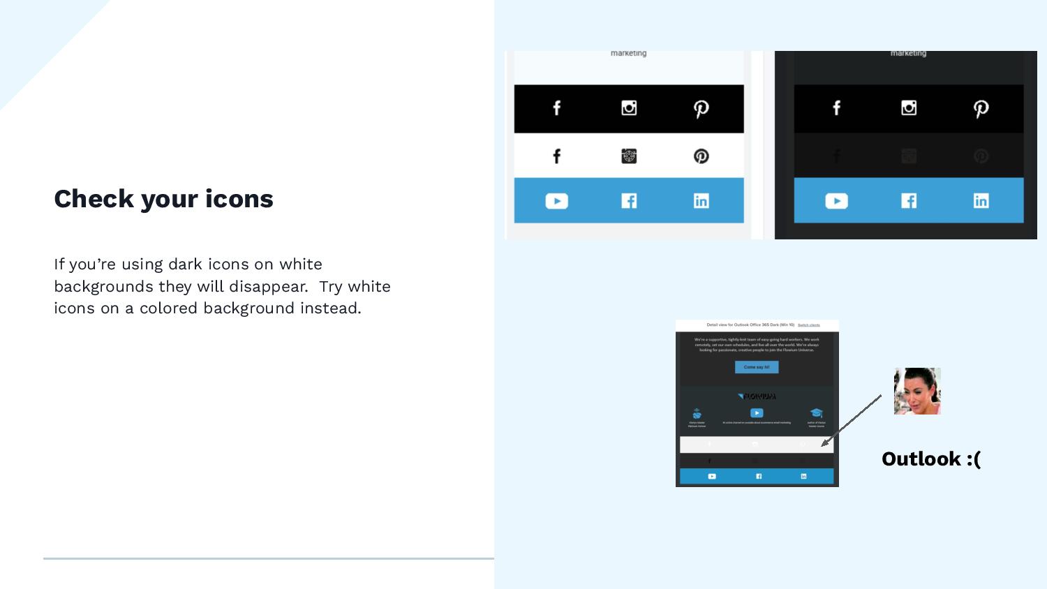
Here’s Outlook. Outlook is a whole other story. We need to do a separate video on this. It’s so inconsistent. Like you can see, it turned the background gray here. You can’t see anything. It kept my blue background here.
So Outlook is a little bit finicky. You gotta work on that. If you have a lot of people reading in Outlook, especially if you’re more of a B2C or like a business client, you really wanna look at your Outlook test results because, man, Outlook is a beast.
But in general, Gmail, Yahoo, you’re gonna see this here. You’ll see the icons disappear when they’re black on white. So you can do maybe like a poppy color and do a white icon. You can play around with this, but definitely double-check these in your footer because they tend to get lost.
#5 – Test your emails as much as you can
And then lastly, just test your emails as much as you can. You can use a platform like Litmus, which it can be on the pricey side, but it’s totally worth it. Litmus or Email on Acid is another good one.
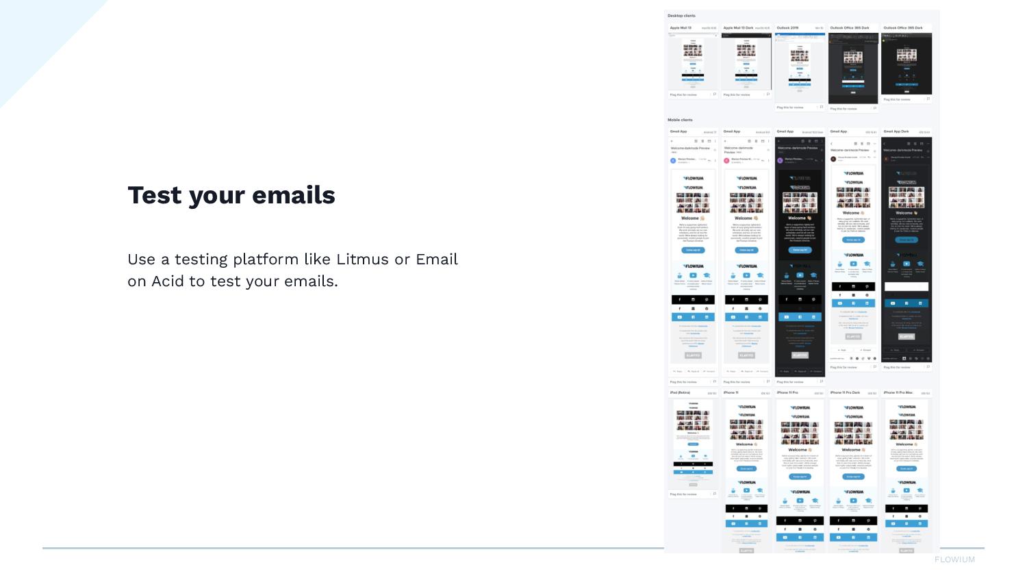
So when you create a campaign, you are then running it through one of these tools and you can scan through all of these samples to see like, okay, I can see here, my icons aren’t showing. So what can I do about that?
It’s just really important to test in a tool that will show you desktop, mobile, dark mode, light mode. You wanna see all of these different variations to make sure that you’re sending out the best campaigns for your clients.
Alrighty, that is it. If you have any questions, feel free to ask in the comments and that’s it for now. Thank you.


