Minor Updated Article: April 1, 2026
We are certain that many people have received low-quality emails with indistinguishable or too small text to read. Such emails are instantly scrolled through and not perceived. The same goes for emails with unpleasant color schemes that are hard to look at. These are often considered low-quality emails, and you would not want to read them at all.
Now imagine that even the most thoughtful and high-quality emails are not perceived by a large percentage of people. That is because even the best emails are often not designed for people with disabilities. People with certain physical impairments can actually make up a fairly large percentage of your subscribers.
What is Email Accessibility?
Accessibility is the need to deliver content not only to people with different types of devices but also to people with certain physical disabilities. You shouldn’t forget about this category of your subscribers because they can make up a significant share, regardless of your services. Ignoring email accessibility can only lead to a decrease in subscriptions and revenue. We will define it as follows:
Email accessibility is a mandatory strategy of writing, developing, forming, and coding HTML emails designed to make content easily understandable and engaging for subscribers regardless of their physical or mental limitations. This concept also includes optimizing newsletters for assistive technologies that people with disabilities can use to access email accounts.
Developing your own strategies to improve your email accessibility is a complex process that you’ll need to do regularly, and it will require a lot of effort. However, it will be worth it in the long run and will bring you a lot of benefits.
It is definitely in your best interest to make your newsletters accessible to everyone. That is why we have created this blog post to provide you with the email accessibility best practices for creating highly accessible content.
Focus on Optimization of Email Accessibility?
The Email Markup Consortium, in collaboration with Parcel.io, has been conducting research on the state of accessibility of online content for three years. The main object of their research is email accessibility. In 2024, they analyzed more than 400 thousand emails. The database of their emails included campaigns from different languages.
| Issue severity | Percentage of emails |
|---|---|
| Critical | 66.68% (272,968 emails) |
| Serious | 33.29% (136,279 emails) |
| Moderate | < 0.01% (2 emails) |
| Mild | 0.02% (80 emails) |
| No issues | 0.01% (28 emails) |
The results of the analysis are still extremely disappointing. To the nearest percentage, 99.97% of the analyzed emails were rated as Critical and Serious lack of accessible emails. These ratings mean that these emails are nearly blocked content for people with disabilities, which will partially prevent them from accessing key aspects of the messages.
At these levels, even assistive technologies will not help people with disabilities to fully comprehend the information. The Email Markup Consortium also notes that companies with Critical level emails, which account for 66%, are at risk and should act as soon as possible to fix this problem.
Judging by this study, you can see that this aspect is underdeveloped, which is unacceptable not only from the angle of morality but also from the angle of distributing content among the audience and its growth. To explore this aspect, we recommend listening to our podcast on email accessibility with Megan Boshuyzen.
Importance of Accessible Email in Marketing
To understand the importance of email accessibility, just think about the number of people with different disabilities. How many visually impaired people do you know? Anything from nearsightedness, farsightedness, or just bad eyesight.
- According to research, over one billion people live with some form of disability.
- More than 2.2 billion people, from all over the world, have a near or distant vision impairment.
- Nearly 10% of all people have dyslexia.
How many people nowadays wear glasses to improve their vision because of working with screens? That is not to mention the elderly. All of these people will have trouble reading your text, especially if there is so much of it that it becomes indistinguishable due to its size. 6th part of the world’s people suffer from dyslexia, which will certainly cause them problems with reading your text.
It is wrong to think that accessibility is something you do for a small percentage of your subscribers. It’s an improvement in the quality of your campaign as a whole because accessibility also means that your emails are easy to engage with and support crucial customer communications.
Why do You Need Email Accessibility Optimization?
It is obvious that general accessibility is the right thing, but you may be wondering what other benefits this aspect will bring you.
Improving the content
Generally speaking, emails with proper high color contrast, legible fonts, descriptive CTAs, etc. will definitely improve the overall quality of the content you provide, not only for people with disabilities but for all subscribers.
Reaching a wider audience
Higher quality and more accessible content proportionally means reaching and increasing the audience.
Improve the trust and credibility of your brand
Your main marketing target is your audience, which means that taking care of it is obviously the right thing to do. Caring for your audience increases their trust in you since they feel valued.
Outperforming the competition
Email accessibility is an ongoing and developing topic, meaning it is unlikely that your competitors have already implemented this aspect in their campaigns. Implementing it before them will put you ahead and a level higher.
More engagement and retention
If your subscribers can’t understand your content and can’t engage with your call-to-actions, they won’t bother and will leave you. They won’t be interested in your next future emails and they definitely won’t be waiting for them. These actions will have a negative impact on you, increasing the unsubscribe rate and decreasing the retention rate. Implementing the accessibility aspect will help prevent this from happening.
Reduce legal risk
In the United States, there are many reasons to sue for lack of content accessibility. According to a report by Accessibility Works, there were 4,000 such lawsuits in 2024, and that’s just the certified ones. Save the reputation of your organization and do not become a part of their 2026 report, pay attention to accessibility now.
Our advice is to implement content accessibility not only in emails but in your company as a whole. Not only emails can be sued. Web pages with increased accessibility have been observed to get better SEO results and more traffic.
Conditions to Consider in Accessibility Implementation
To implement this aspect in your campaigns, you first need to understand what aspects should be considered in order to know what needs to be changed. Human disabilities that impede the perception of emails can be more than just visual impairments. We will list the human disabilities that need to be taken into account and considered to implement better accessibility in these cases.

- Vision impairments
Visual impairments include more than just blindness and low vision. It also includes color blindness, brightness sensitivities, cataracts, glaucoma, and diabetic retinopathy. Vision problems are the most common problem that can interfere with the perception of your content. People with these problems often rely on screen readers.
- Hearing impairments
If your emails include podcasts or videos, you will need to think about people with hearing impairments or the absence of it. Pay attention to the presence of video captions and podcast transcripts.
- Cognitive and neurological disorders
People with disabilities who may have trouble understanding emails also include people with cognitive and neurological disabilities that affect memory, attention, or comprehension. That’s why it’s best practice to avoid overwhelming users with too much information, including the excessive use of emojis and GIFs. When designing emails, it’s important to use a simple layout and presentation, avoid technical language, and add clear instructions when necessary.
- Motor disabilities
Physical disabilities can refer to people who have problems with hand motor function. These include such side issues as hand tremors, lack of coordination, paralysis, missing limbs, or simply broken arms, all of which make it difficult to scroll and interact through email. Make sure that there are no problems scrolling through emails and that the size of buttons and links is appropriate, so that they can be tapped on touch screens or assistive technology.
- Speaking disabilities
Speech impairments may not affect the perception of emails, but if your subscribers want to contact you about their questions, cooperation, or just to get in touch with support, you should have live chats for them to contact you. In most cases, companies leave the calling function for contacting, but you’d better take care of people with speech difficulties and add various communication functions, starting with basic chats.
20+ Email Accessibility Best Practices
We have already given all the reasons why accessibility matters. Now is the time to provide you with email accessibility guidelines that will improve the quality of your emails and make them more accessible. When implementing accessibility, you need to improve 3 aspects of your emails. These aspects are copywriting, design, and coding.
Accessible Email Copywriting
The general tips for writing accessible text are very similar to the general tips for good copywriting, which means that you do not have to put much effort into it. The main task is to simplify the text as much as possible and present it in a convenient, understandable structure that will not hinder navigation and concentration. Below, we list the best practices to achieve this simply.
- Avoid long sentences and large paragraphs.
- Don’t use complicated introductory words.
- Blocks of solid text are difficult to read even for average users.
- Use active voice, and simple words without complicated abstruse terminology.
- For the structure, it is useful to use headings, subheadings, and bullet points. This will simplify not only readability for subscribers but also for assistive technologies.
- Make sure that there is alt text under each important image and it should be written by a copywriter or marketer, not a developer. Still, you don’t have to write text for images that are used only for decoration and aesthetics.
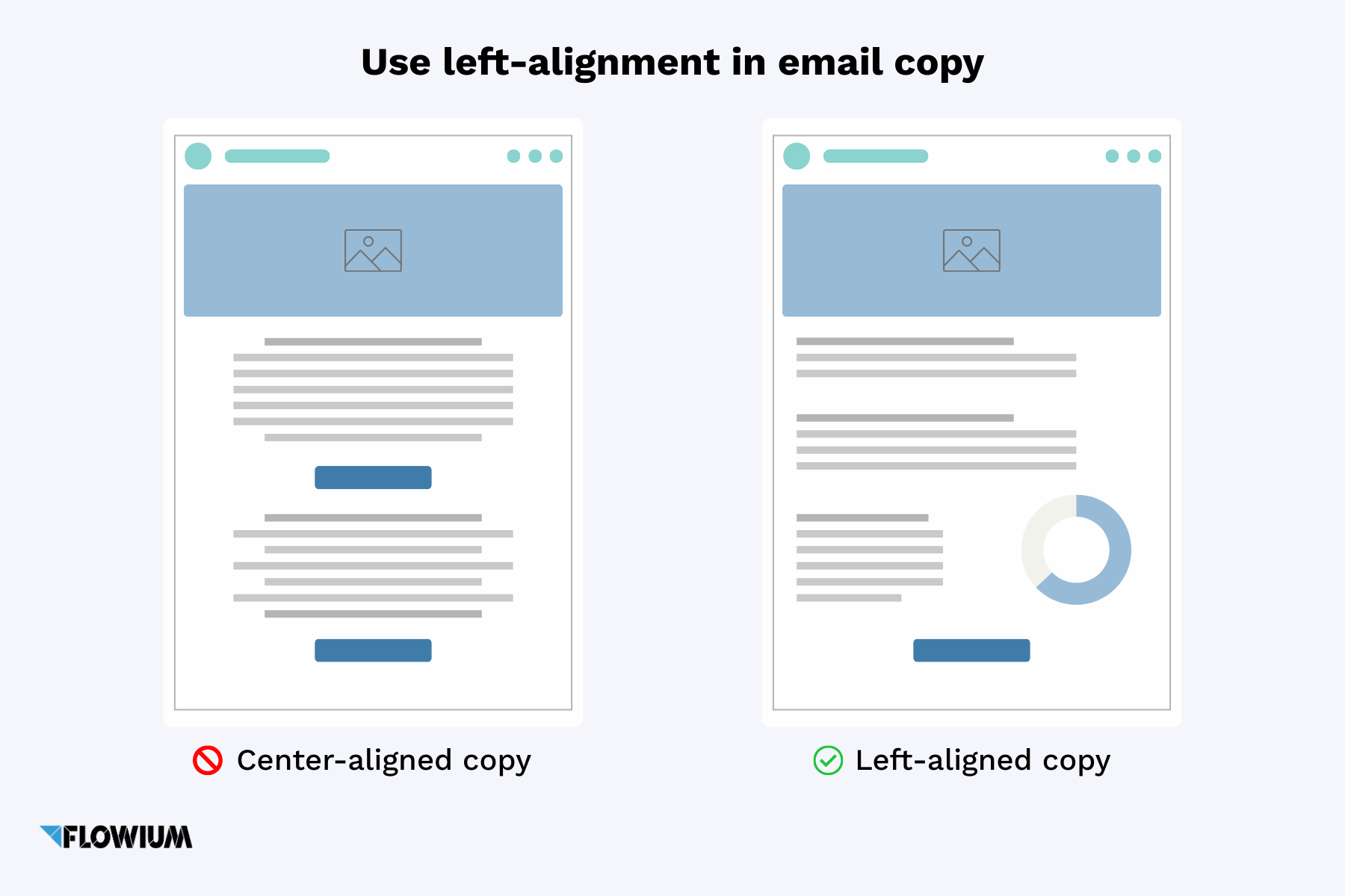
- People with dyslexia may have trouble reading text written in the center. Using left-align in your text layout will greatly improve its overall readability and make your text more accessible.
- Adjust the line spacing, as fonts that are too tight can be difficult to read.
- Pay attention to the typography, too small font is unreadable, make it at least 16 px, and make sure it is readable on the mobile.
- Keep the buttons free of plain text like “click here” by adding more informative text. If your link is tied to a particular phrase in the text, the information it is tied to should be matched to what it refers to and be clear enough to explain where it is directed.
- Your subject lines should be not only interesting and engaging but also sufficiently descriptive.
Accessible Email Design
From the disabilities we mentioned earlier, there are many graphical aspects that should be taken into account. Here are practices to improve visual accessibility, among them are tips to improve the overall design and the color scheme.
- All text in emails should be live, not graphic, of course, this will increase the amount of work on the email, but it is necessary. This applies to everything: images, CTAs, buttons, promo codes, dates, and times. This applies to all text, and especially the most important text, which contains the information subscribers need.
- Do not use different colors to emphasize text. People who are colorblind will have trouble understanding it, not to mention that screen readers cannot interpret color.
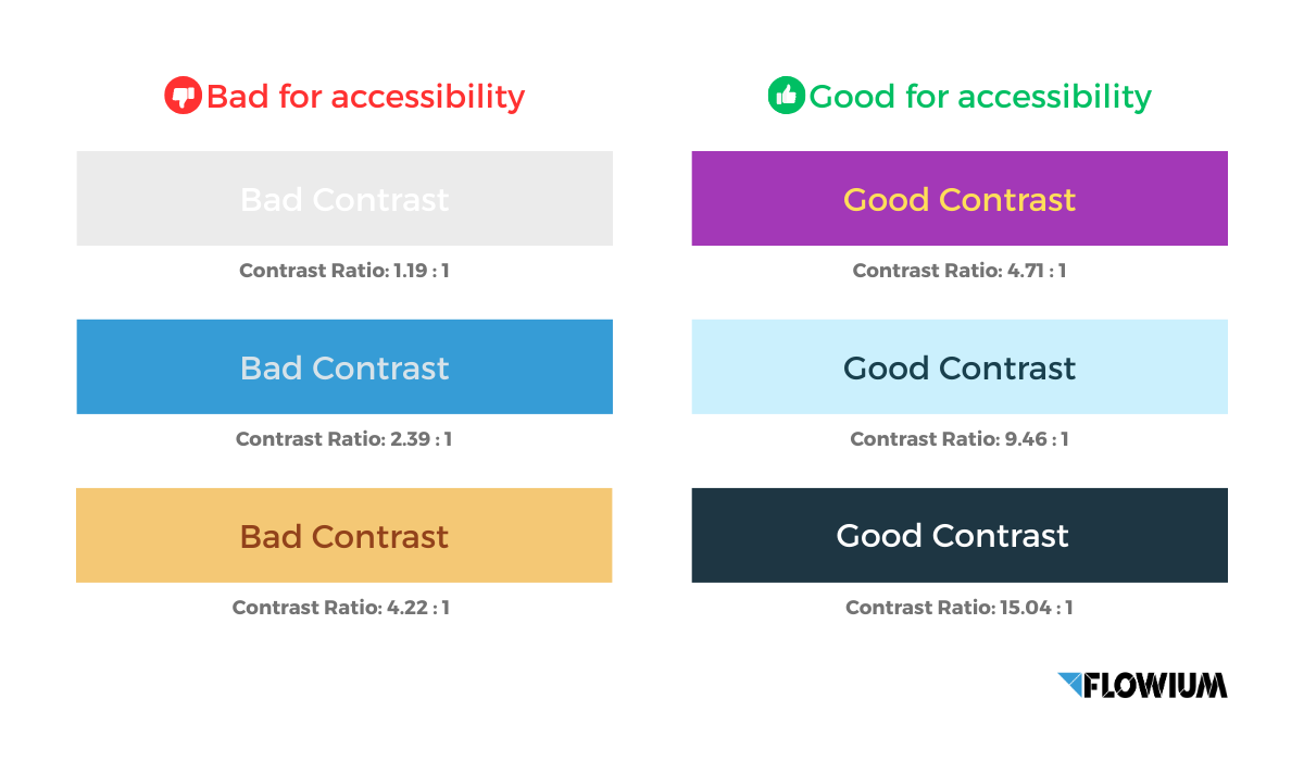
- Pay attention to the contrast of the text and the background, a good contrast is 4.5:1. The best contrast is black text on a white background with a value of 21:1. A value of 1:1 means that both have the same tone. Check out the scheme to evaluate the color combinations for yourself.
- Leave enough clean white space, too busy a space can cause inconvenience for subscribers with ADD or ADHD.
- It may sound like an obvious tip but don’t fill your emails with images only. There are many reasons for this, some email clients can block your images completely, besides, when you add alt text, you simply won’t have enough space for it. Stick to the standard 80:20 ratio of text and images in emails.
- Stick to a simple email layout. There is no need to create many columns of information with images or graphs. The one-column layout is the best for accessibility, and is much better than using cumbersome tables.
- Make your buttons and links stand out with more than just color. Make your interactive elements stand out without changing the color scheme alone, which will make them easier to understand for colorblind people.
- If you attach files or documents or other attachments to your emails, make sure they are accessible and noticeable. To make your documents more accessible, emphasize them with a specific heading, text, frame, or color.
Accessible Email Code
The code used in your emails should not interfere with assistive technology such as screen readers or keyboard navigation tools. Users won’t see the code, but many accessibility features rely heavily on it. Follow our tips for writing better code to improve its accessibility and enhance newsletters.
- In order to avoid the problem with font size, developers need to include inline CSS styling, which will guarantee a stable minimum font that you prefer.
- Using “em” units to encode font size is preferred because it is more flexible than using “px”. While pixels are static, “em” is relative.
- To italicize the text, often used either <em> or <i>. However, using <em> as opposed to <i> will tell the screen reader to underline a certain word.
- In terms of accessibility, it is better to use paragraph tags <p> because a paragraph means something, while line breaks <br> can only be used for spacing.
- Actively use h-tags for different headings or text that starts a new section of information, this way will be more effective for structuring than just increasing the size of the text. Using h-tags will also help subscribers who use assistive technology, as it will improve navigation and allow them to scroll through entire sections of your email.
- All your tables and images should be coded with the role=“presentation” tag. Previously, tables were used only for structure, but certain features of some email clients have made it necessary to use tables as a design element. However, if you want screen readers to be able to distinguish between tables for design and tables with important information, you should specify the important ones with the role=“presentation” tag. This will allow the screen reader not to read every cell of the table, but to proceed to the important content.
Create Accessible Emails with Flowium
After reviewing all the surveys, we can conclude that implementing email accessibility is not a simple task. This task requires expert skills in creating newsletters, such as coding, design, and proper copywriting. Despite the difficulty of the task, the importance of accessibility cannot be overstated.
If you want to send high-quality newsletters and create incomparable campaigns that will be easily accessible, but don’t have enough experience in this area, the best solution is to contact us. Flowium is a company with extensive experience in creating email campaigns. We will be able to implement any aspects you need upon your request. Implement accessibility with Flowium.

